
From Function to Finish
Before getting carried away with colours and finishes, I focused on the composition and functionality of the pen. You can catch up on that in the earlier blog posts. The next step of the process was to put my colour compendiums, paper swatch books and paint charts to good use, and start to pick out the hues of our first pen collection.


Choosing the Right Materials
The body of the pen will be made from natural wood and finished in one of five colours. It will have a matt, uncoated finish. The knock button and taper will be brass and the body of the pen will be subtly foil stamped in gold with 'Papersmiths'.


The Family Survey
I conducted a small survey to whittle down my initial selection of colours. My survey group was made up of four family members (thanks lockdown!). Two colours passed the test with flying colours and achieved 75% of the voting body's approval, whereas there was a distinct lack of pattern when it came to the others. No clear winners.

From Twelve to Five: Narrowing the Palette
So I decided to take twelve colours forward for sampling to give me a better idea of what they'd look like as a pen body. This also meant I'd be able to look at them alongside our notebooks, in their true pen shape, and start to see how they'd all work together.
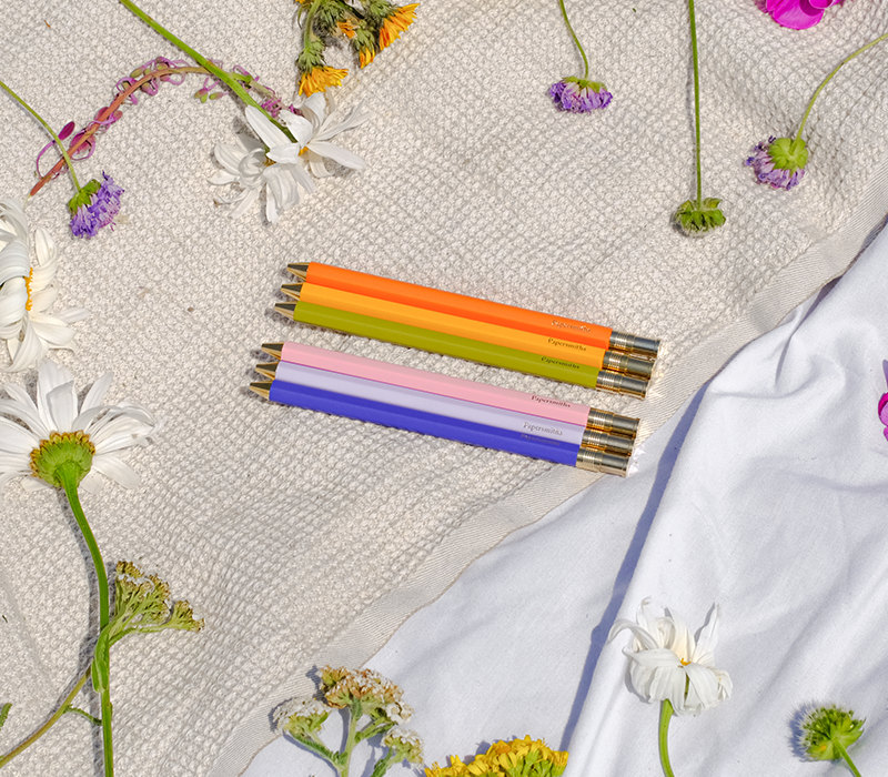
Next, I sent the chosen colour swatches off to the factory for sampling. And here are the results.

 \
\The Best Selling Pen: Final Features
- Natural wood body
- Matt, uncoated finish
- Five colour options
- Brass knock button and taper
- Gold foil Papersmiths stamp
Discover the finished Everyday Pen collection - five timeless colours designed to pair perfectly with our notebooks. Shop the full range here
Need a Notebook to go with your pen?
Want your say in future collections? Follow our Instagram for regular updates


