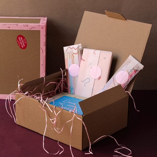
Richard Sanderson is one half of Esme Winter, a creative studio who specialise in designing patterns and richly decorated papers. Their paper adorns gift wrap, boxes, notebooks and cards, and their 20th century inspired motifs call to mind the glamour of a bygone era. We sat down with Richard to discuss a childhood filled with crafts, and the studio’s love for the art of correspondence.

When did your love of paper begin? I imagine you were both brought up surrounded by antique books and eclectic printed ephemera. Do you have any fond childhood memories?
Hello, Papersmiths! It’s a privilege to be featured on Duly Noted.
Esme’s parent’s specialist auction house was, and still is, a treasure trove of influences, rifling through books, decorative papers and beautiful ephemera fostered a natural appreciation for all things print, pattern and paper.
I enjoyed a childhood of farmyard freedom contrasted with the influence of my grandparent's architectural practise and their enthusiasm for 20th century art and design.
Both having creative families meant homemade cards were a constant for any occasion - Potato prints, collage, magic markers! We are still inspired today by the memories of making and receiving these special gifts.
Are we right in thinking you met here in Bristol at UWE? What did you both study? Do you think the city’s independent spirit and infatuation with all things print inspired you to pursue your own business?
Absolutely, Bristol is a special place to us as it’s where we met. We love it for its inspiring creative spirit. In particular, the friendly atmosphere, the unique independent businesses, culture and amazing food. There’s always something new popping up.
Esme is a born and bred Bristolian! She studied Textile Design and Richard studied Illustration. We both learnt to print at the beautiful studios in Ashton Court.

The patterns of your decorative papers call to my mind the glamour of a bygone era. The 20th century motifs and Florentine inspired designs are just so sumptuous and sophisticated. How does a pattern start its life?
Thank you very much!
It’s a hands-on process; every design starts life using pen and paper. This is a very organic stage, drawing pattern can almost be meditative. Keeping a clear head and simply drawing without distraction (sometimes difficult with our studio Poodle…!)
We also find it’s helpful to step away and revisit a design at a later date - often the patterns feel very different from before. After this, we refine and play with the scale, shape and colours.
As for inspiration, we’ve been lucky enough to have been exposed to great art and design from a young age. We never tire of work by Eric Ravilious, Mary Fedden, Enid Marx, Barron & Larcher, The Bauhaus and The Bloomsbury Group. We also dream of living and working in a magical setting like Kettle’s Yard, Cambridge.
We're big believers that pattern and colour can have a meaningful effect on your everyday surroundings, however small.

What was it about Jemma Lewis’ work that made you want to collaborate?
Jemma is highly regarded in bookbinding circles for her original marbled papers. We discovered her work through World of Interiors magazine and had to visit!
For our collaboration, we both wanted to celebrate the skilled techniques of traditional marbling and introduce this unique form of paper decoration to a new audience.
Tell us about the materials you use and the methods you follow. Why is it important to you to adhere to these traditional processes? Is there a certain quality or feel that you achieve?
We like to use a range of processes and materials and more often than not these are the time-honoured ways of working!
For example, we print our paper using the Offset Lithography method, a traditional technique for commercial scale printmaking. The Curwen Press utilised an early form of offset litho when working with Bawden Ravilious, Nash. in the late 20’s and early 30’s. We hope to retain that feel.
Also, our recent collection of cards were letterpress printed. We are involved from start to finish, mixing inks, proofing samples to finished production. The people we work with mean a lot to our business.
We use a selection of different paper stocks but always aim for those that are Archival (an important element for bookbinding) and ecologically sound, whether recycled papers or FSC approved. We also use vegetable-based inks, but this is almost universal in most printing presses these days.
Ultimately we’re looking for a balance between texture and ink reaction when choosing papers.
Our aim is to appreciate different technologies, materials and their possibilities. To have the patience and perseverance to do something well.

What are your biggest inspirations?
We love the artists and designers mentioned earlier. But we must give a special mention for the brand Marimekko, who have conveyed the timeless joy of pattern and colour so well for so long.
What are your values?
To send a heartfelt handwritten message, share a beautifully presented gift or keep a special card on your mantelpiece is a wonderful thing. We want to encourage and enrich this honest, tactile way of communicating in our very digital world.

Thank you Richard and Esme!
Follow Esme Winter on Instagram
